


Pantone’s Peach Fuzz is a Fizzle
The 2024 Color of the Year is more background than standout.

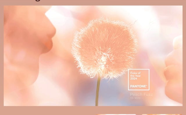
Image from the Pantone website. The full press release can be found here.
On Thursday, October 7, Pantone Color Institute announced their choice for the 2024 Color of the Year was Peach Fuzz, a warm, pastel shade of orange, specified as 13-1023 in the company’s trademarked color category system. Color geeks everywhere are absolutely gutted. Some of the responses I’ve read and heard include: “the salmon paint used in 1980s living rooms”; “horrible, lifeless beige”; and “didn’t the Queen Mum wear that?”
Laurie Pressman, VP of the Pantone Color Institute led a webinar presentation that explained the background and research behind the color choice for this next year. The Pantone consultancy researches design trends, along with economic and social forecasts to predict consumer moods and desires in the year ahead, then seeks to symbolize that concept in color. The color gurus foresee that current global turmoil and economic difficulties have created a need for comfort, connection with loved ones, and a focus on well-being and health in the mind of consumers. According to Pressman, the keywords associated with the color Peach Fuzz include: heartfelt; soft; kind; nurturing; all-embracing; tender; compassionate; tactile; calming; cocooned warmth.
Texture and tactility is a big theme for the year ahead, as could be seen in the images chosen by Pantone to showcase the new color. There were oodles of marabou feathers, flokati sheepskin, sherpa fleece, velvets, and satins galore. Shades of gray were frequently contrasted with the pale peach tones to enhance the softness of the pastel.
It seems to me that while cozy textures may reflect our desire for cocooning in hard times, the pale peach pastel may not really fulfill that aspiration. For one thing, as a pastel, it has a cooler feel to it than a deeper, richer orange-based earth tone might. It is certainly flattering to a lot of skin tones, but the concept of “powder” shades is a little dated. Finally, while it may look very luxe in a high-end spa, pale peach just doesn’t function as a floor covering in a home with pets or children.
Of course, designers in all industries will want to know the specifications for Peach Fuzz. The closest Hex equivalent is #ffbe98 for web design. When using RGB, select 255R 190G 152B. Print designers should use 0C 25M 40Y 0K to specify the 4-color version of Peach Fuzz. Encycolorpedia has a full list of equivalents and conversions—scroll down the page for the full list of color systems.
Hyatt’s is an online art and graphics supply store that has a wide range of Pantone color specification gear, including swatches.
The Wall St Journal has a video showing the foundations of the Pantone business.
I was thoroughly underwhelmed when I heard the announcement about Peach Fuzz. I will need to do some extensive swatching & construct a Pinterest mood board to see if I can gain some enthusiasm for this bland shade. My first thought was that it was almost the exact color we had painted our living room in 1982 as newlyweds! My second thought was that Peach Fuzz was one of the main wardrobe colors in the classic ‘80s TV series, Miami Vice. Sonny Crockett called, he wants his linen jacket back. 🤪
Over to you! What are your thoughts about Peach Fuzz, the latest edition of Pantone’s Color of the Year?
Such a strange choice although it reminds me of spring which always feels hopeful ✨💖
I had the same reaction you did...total meh! 🫤 (It really should have been green!)