

Flashback Friday. . .
Flashback Friday. . .
Memories of painting a turban squash

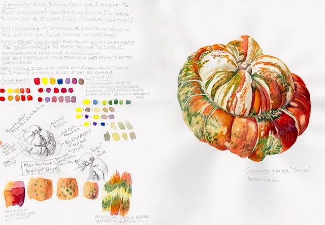
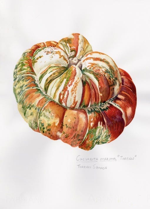
November, 2015. I was enrolled in the Royal Botanical Garden of Edinburgh’s online post-graduate diploma in botanical illustration, a very challenging 3-year course in technical illustration and botany. We had just started the second module of the first year, a unit on watercolor. The assignment was to portray a vegetable in watercolor, matching the colors to the live specimen, and recording our notes as we painted. I chose a multi-colored, sculptural turban squash, because I had challenged and failed at this motif many times before over the years.
Turban squashes are famous for the mix of bright orange, green, and shades of cream & ochre, colors that form patterns of spots and stripes unique to each squash. How to deepen each color in equal relation to the others in the shadow areas of the form? How to darken orange by adding the complementary without making it muddy? So many details to think about!


Finally, the painting was finished. But it seemed disjointed; the areas in the shadow did not flow across the surface of form, but looked like coarsely stitched patches in a quilt. I would need to add one more wash of thin, liquid watercolor to unify the colors. It would be a very fluid, wet wash; I would need to apply it smoothly and quickly, with a light touch to avoid disturbing the layers of pigment already placed on the paper. If I failed, I would have a squash-shaped mess of muddy brown. I mixed the paint, I held my breath, and took my large brush and gently swiped over the shadow side of the squash.
It worked.
After the piece had dried, I posted it to the RBGE course portal. I could relax and turn my attention to the final piece in the module, a “library page.” Scanning the module syllabus, my heart sank. The assignment was not for one vegetable, but three different vegetable portraits, each using different color combinations! Arrrggghhhhh! A quick run to the grocery store, and by the end of the weekend, the other 2 pieces in the assignment were done. But this squash is the one I remember.
I’m going to try this with watercolors ❤️ Applying a thin layer of acrylic ink is something I often do in my mixed media and watercolor paintings to really get a pop. I’d no idea such a program for learning was available... sounds intense but so interesting. Thanks for sharing your beautiful work! Have a wonderful holiday, Wren ✨
Ooh, this squash is so good! I’ve drawn squashes in Procreate using layers, fancy brushes and blend modes. I can’t imagine how much harder it must be doing this in watercolour! You are a fantastic artist!